
Trove Collective
Onboarding for a new, curated social media platform
MVP Design for Android

What is Trove Collective?
Trove Collective is a social microblogging platform for people who value curiosity, learning, and sharing. I joined the team as a contract lead product designer to conduct the end to end design process for the first app release.
Timeline
3 months
Skip to:
OVERVIEW
My role
Lead Product Designer
Collaboration
CEO, CMO, Tech Lead
Deliverable
Android
What problem were we solving?
Why solve this problem?
Users needed a way to feel connected to the product’s first app while also understanding its unique social media features.
Social media users interested in Trove needed to understand the platform and its capabilities to have a positive first impression. We aimed to hit a conversation rate of 80% or higher for users who download the app and completed account signup.
Preview of the solution

DISCOVERY
A few of the onboarding product requirements
Minimum 3 areas of interest in user profile creation
Add friends and connections capability
Bio page with required input fields
Intro/How to discover content
Intro/How to create and share content
Waitlist to build anticipation before product is released

Who is a Trove user?
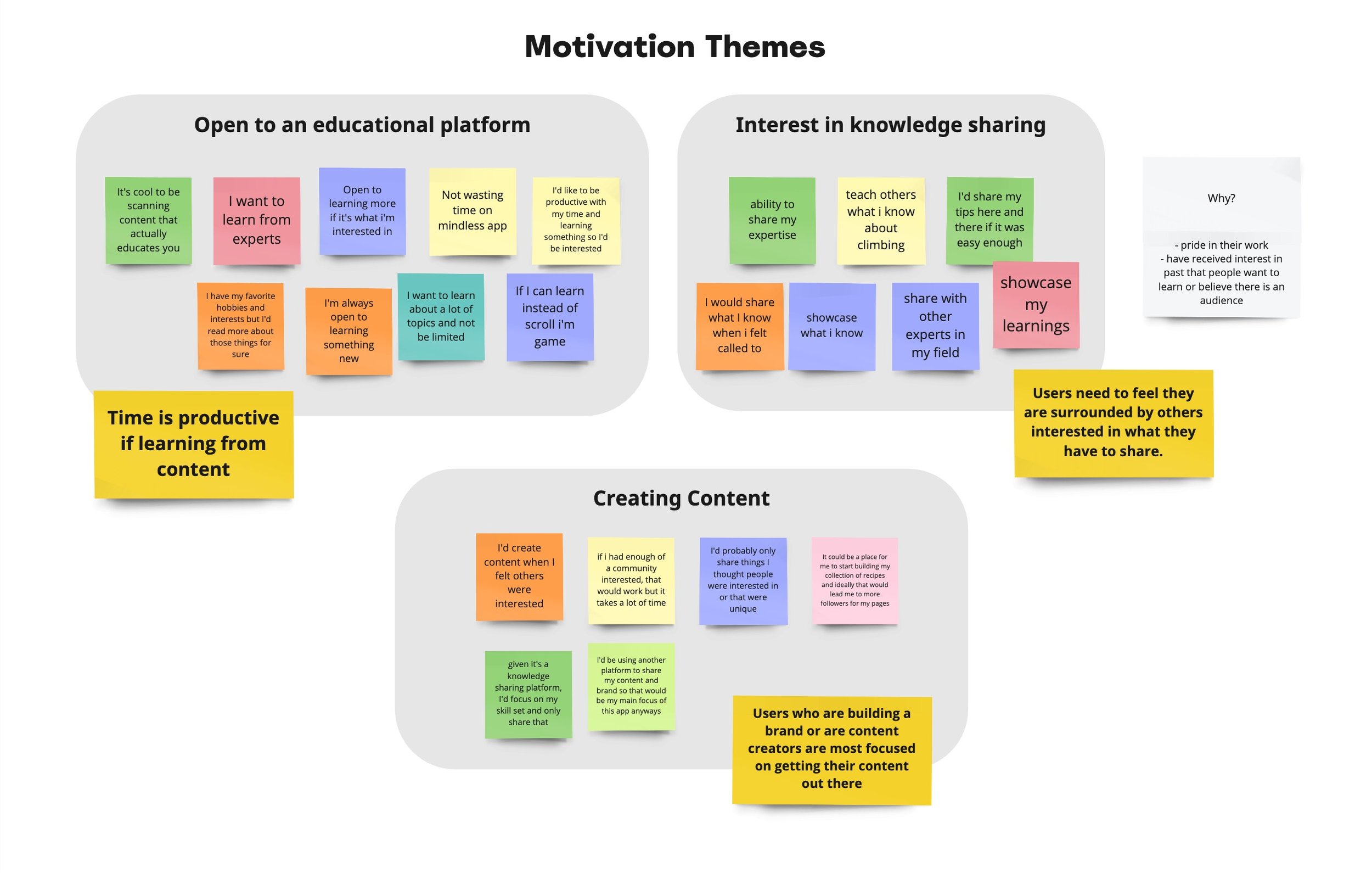
To really understand Trove’s place in the marketplace, we needed to understand the users it would attract. The CEO and Head of Marketing had conducted one batch of qualitative interviews so I tacked on a few more interviews and synthesized our notes.
I discovered the following key themes about social media usage:
Users felt time is productive on social media when the content is educational.
Users desire a sense of community with others who share the same interests and curiosities.
Users who share content care a lot about reaching people who are interested.
Content creators are overwhelmingly motivated by sharing their work more than exploring what others are doing.
We discovered the importance of creating a unique, curated account and building a social media feed that speaks to their interests and motivations.
It was clear that Trove needed to be the artistic curation of social media platforms in comparison to Instagram, Twitter, or Pinterest which have the capabilities of being grab bag experiences.
Four unique users emerged after affinity mapping. We created personas to help us tell the story of how the Trove experience can vary for different user needs.
What does this mean for onboarding?
Developing the Trove personas


Competitive analysis
DEFINE
Trove’s angle of providing a curated online community was unique, but we needed to examine the competitive space to ensure we provided an intuitive familiar onboarding exprience.
I studied several content-focused social media products including Medium, Tumblr, Swarm, and Meetup. The variety of their offerings provided a wide range of onboarding approaches.
Three key insights emerged that helped define our edge:
A balance between personalization and guidance makes for a smooth, fast onboarding.
A content-first approach highlights necessary steps that users need to be aware of.
Setting up a profile needs to be concise so users can enter into the actual product quickly.

Product requirements & prioritization mapping
The CEO and I created the below list as a hypothesis to pressure test in the design phase. We plotted these on a prioritization map to examine where to start and what to save for later.
HOW MIGHT WE
create a simple onboarding flow that is both instructional and visually enticing?
DESIGN
Sketching: What might this look like?
In laying out the features for our MVP onboarding experience, I prioritized the categories of interest to get the user excited about the process of setting up their profile. I also considered the length of the entire flow. If a signup is too long, it could exhaust the user and potentially change their optimism about the product going into it.

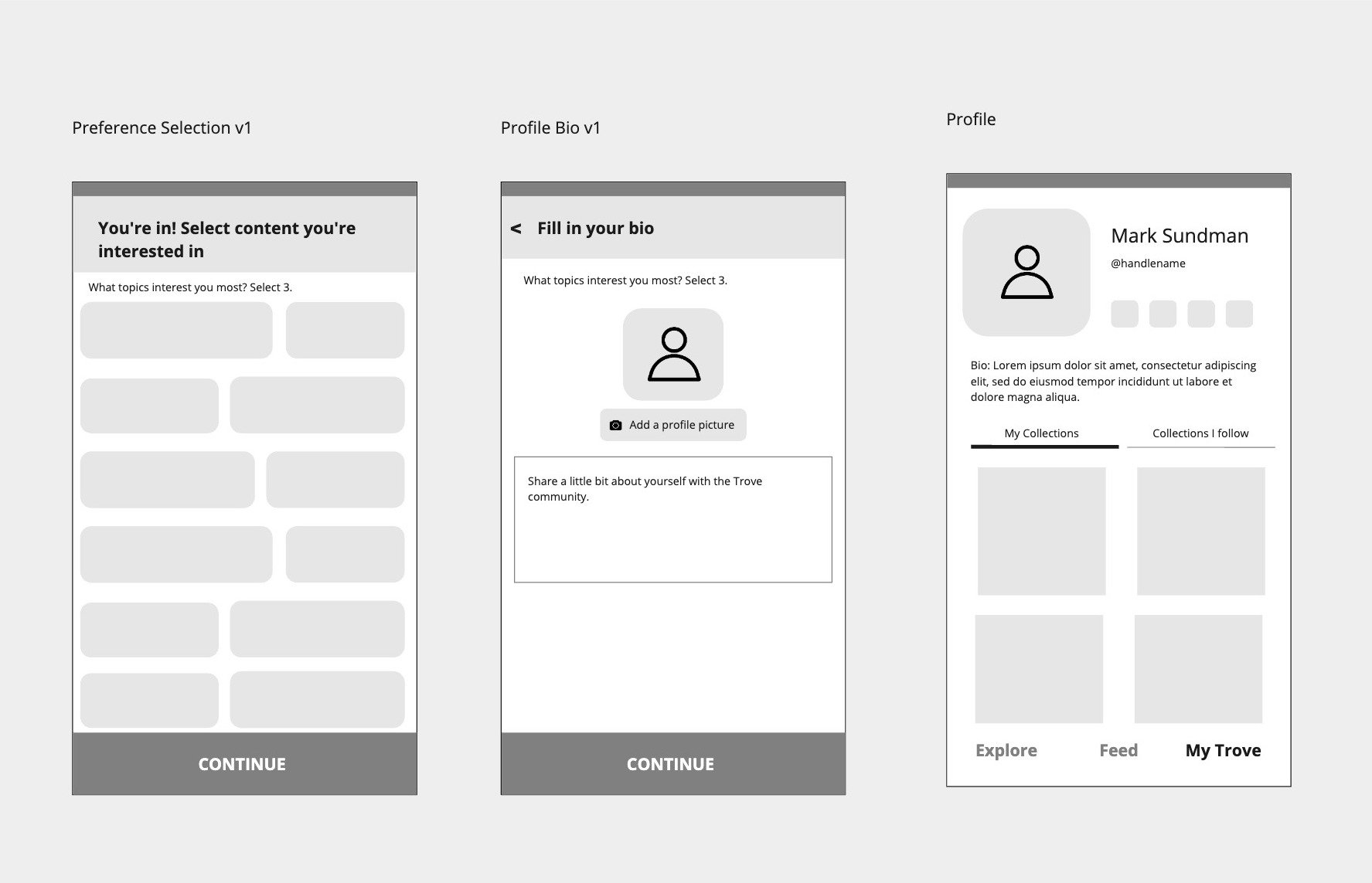


Final screens
Onboarding prototype
“Kinda already know what each category means…”
Testing initial designs
I conducted usability through A/B testing a few variations with potential users. The following insights emerged.


Insight 1: Less text, more options when signing up
“I’d love to see more options and not have to scroll”.
When testing our category selection screen, we originally included examples for each category but we learned from users that this was excessive.
“It’s lots to read through when I just want to get started and into the app.”
Insight 2: Users want to see and review all details of their profile before moving forward.
4 out of 6 users preferred reviewing all of the information that would be visible on their profile before getting into the product.
“It gives me a sense of what others will see and I want to see that full picture.”
Insight 3: Users want to get into the product ASAP after they’ve downloaded the app.
“Exciting to learn about what’s to come but I want to start exploring and getting into the content.”
Even with Insight 2 in mind, users expressed on several occasions that onboarding processes were typically sped through to get into the app that they invested time in downloading and committing to.
“I learn by doing so I’d rather be actually performing the action or visualizing it somehow if I’m learning something new.”
“I’ll take the most important info and keep that in mind but for the most part I just need to get going.”
Carousel exploration
Through the iterative design process, we explored the concept of a short carousel that introduces the product as a whole before a user gets into the actual product. Originally we had mapped this feature as a Do Never feature but in speaking with our tech lead, we found ways to create a low level of difficult tech build with 3 carousel screens.
I explored a few approaches including visual / animation focused, instructional, and iconography focused. We ultimately went with the instructional variation for MVP to focus on adoption of Trove as a product first and foremost.


Measuring success & next steps
EVALUATE & ITERATE
In our pilot sent out to users on our waitlist, we saw a 15% drop off rate in the onboarding experience from first to final screen (Home) which was a huge success. We also saw a conversation rate of 85% of users who downloaded the app to account signup. The next step in this process would be to examine those drop off screens to see if it’s happening at one specific place.
Since the launch of Trove in Fall 2021, the product has been put on pause. I’m very happy with how far the project came and the excitement that we all felt around creating it. I’m excited to see if it will ultimately morph into a similar type of community as the hobbyists, travelers, and learners crave this kind of social media space.


